


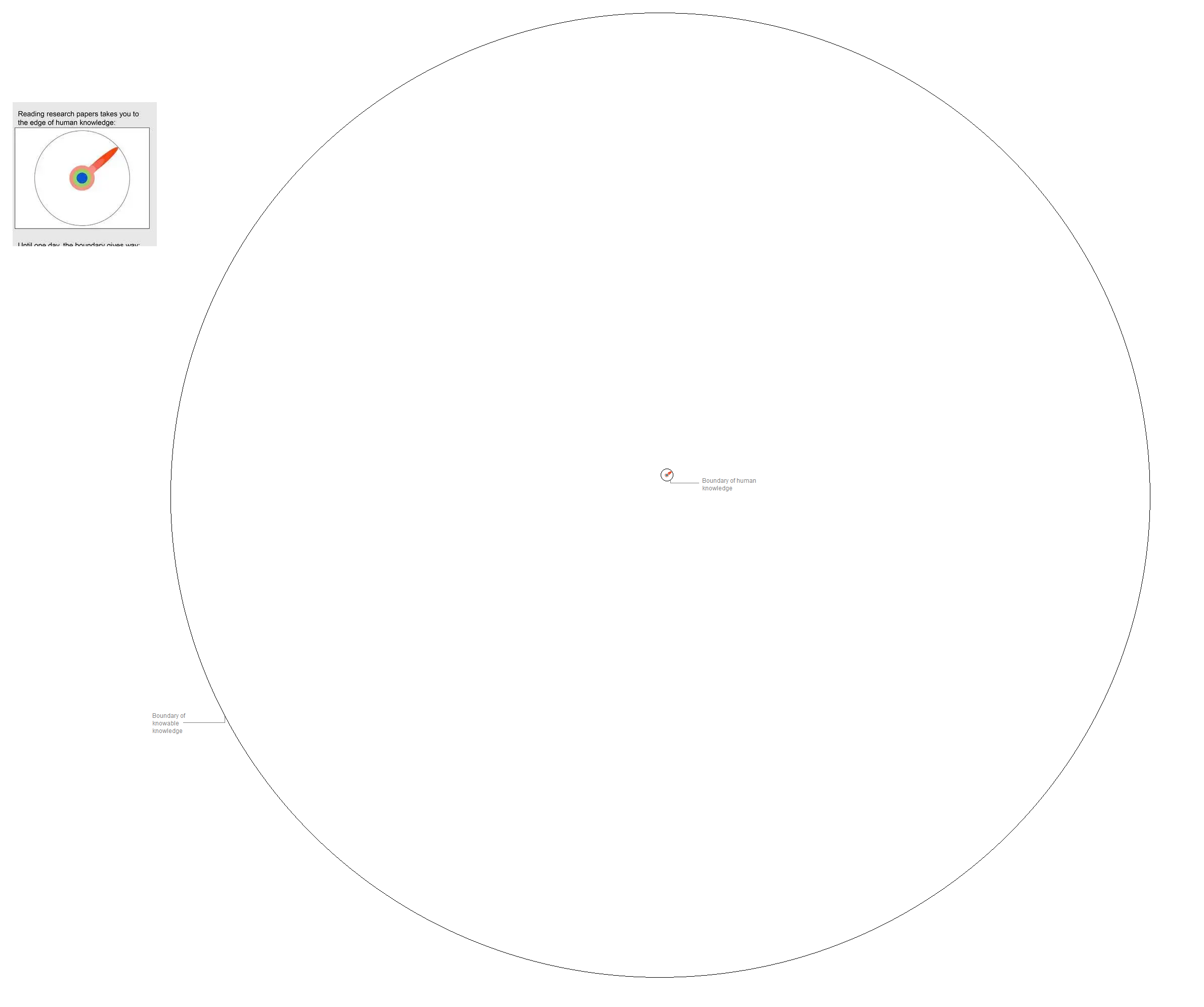
They are being incredibly charitable with the width of that column
and also by not showing the bigger picture
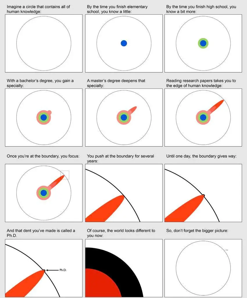
https://i.postimg.cc/V19Jwzqd/knowledge-circle.png
there would also be an even bigger boundary of “all of reality” or something but obvs that would be infinite and impossible to know
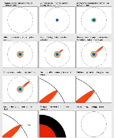
The ratio is off. You learn a lot more from high school and bachelor’s degree and you learn way less with your master. PhD is just expanding a little bit more on master.

The visual is more about highlighting specialization and its distance from the limit of human knowledge. You often can’t represent every aspect of a complex subject at the same time on a single visual. Kinda like how you can’t represent the solar system distances and planet sizes to scale on a single page, you have to pick one.
Anyone knows the origin of this representation? I’ve seen a professor use it years ago and I thought it was his, but I guess not.
Euler giving the circle two big balls and an erection:
O3–


