

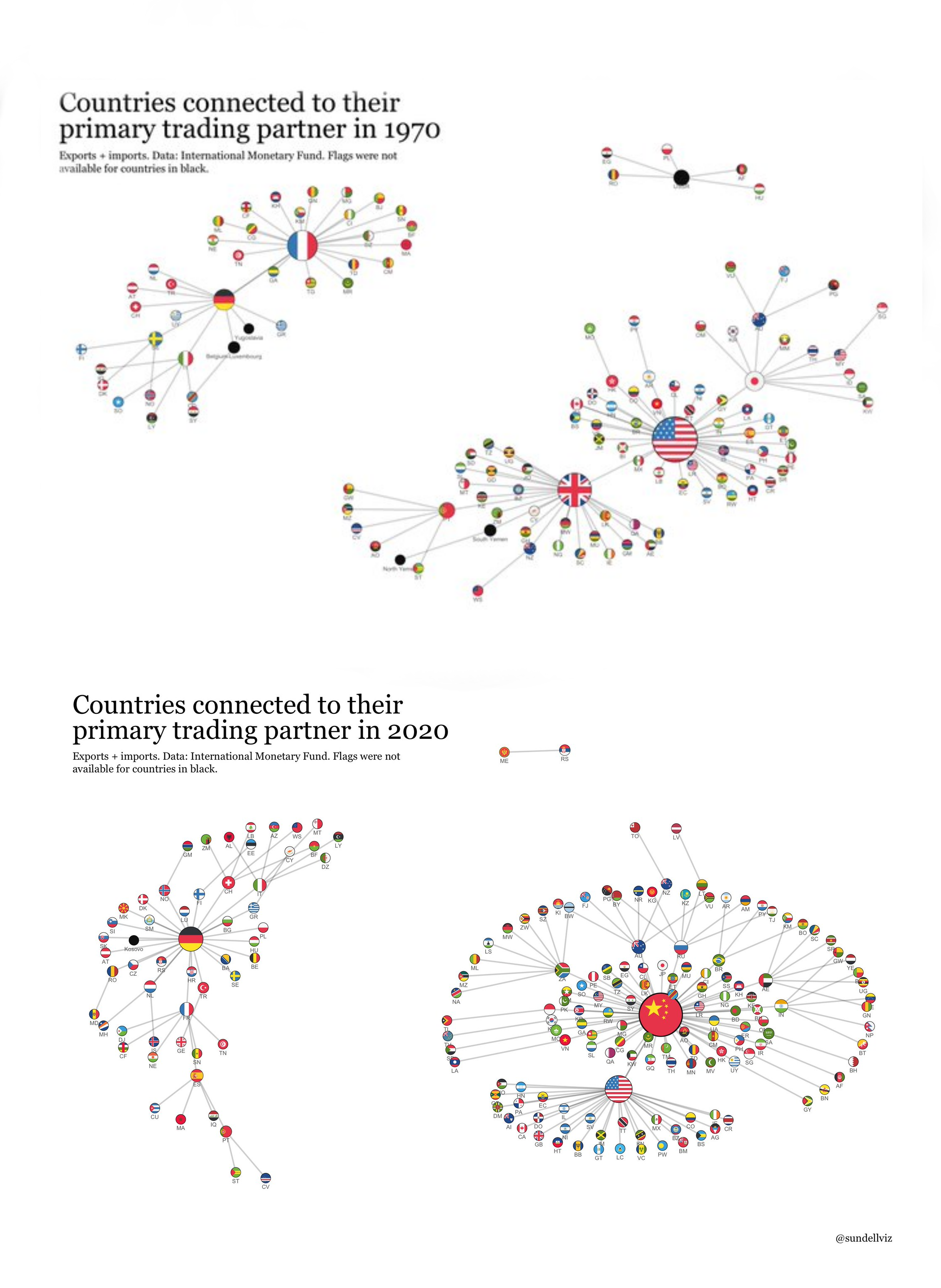
Visualization of countries connecting each to their primary trade partners. The Soviet Bloc is on the top right.
:xi-gun: :deng-salute: :amerikkka: :corn-man-khrush: :stalin-gun-1: :stalin-gun-2:

Flags were not available for countries in black
they couldn’t find a flag for the fucking USSR?

This two-cluster pattern shows up because it’s a very socially stable configuration. I can’t remember the exact math, but I’ll try to remember the gist.
You have a graph of nodes. For anyone who hasn’t gotten into graph theory, it’s not like a bar graph or line graph. It looks more like a network diagram. So you have nodes. These can represent people or countries or if you’re a mathematician, nothing in particular. Nodes can be connected by edges. You can color edges between nodes green to indicate those nodes have a friendly relationship or red for an unfriendly relationship. That’s our model for this particular problem.
You can take any set of three nodes and it will make a triangle. If two edges of that triangle are green, that triangle is considered unstable (imagine how tense it can be when two people you’re friends with are fighting). Taking the entire graph and flipping relationships from good to bad or vice-versa randomly until the graph is stable will tend to create two clusters of nodes where all the nodes in the cluster like each other but hate all the nodes in the opposite cluster.

Some takeaways from this:
-
Get fucked colonialists (Portugal, ‘Great’ Br*tain, even France a little)
-
Germany conquering Europe with loans instead of tanks lol
-
China will be returning to her historical position as a great economic powerhouse, guided by communism, you love to see it :xi-clap:

Enter the Long 21st Century

Not to be pedantic, but why is the USSR completely black? Did they not have their own flag? Or is it meant to represent the godless evil that dwelled within each and every one of their twisted black hearts?


It’s for countries that no longer exist. Yugoslavia, Belgium-Luxembourg, and the Yemens are also black.


