

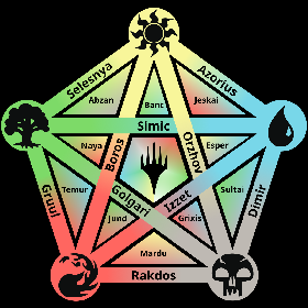
New take on the color pie, hopefully easier to read.

3 points
This is awesome! Great work on this, super useful reference
3 points

3 points
I was thinking while looking at the earlier version that background gradients would make it easier to read. This is indeed an improvement.

5 points
I like this one much better than the original colour pie that was posted here, this one’s much easier to read and more intuitive <3
